The Solution Space is where we help students with Math 1050 (College Algebra) and other higher math classes.
The 3 different hubs are where we help students with all the classes in the Developmental Math program (Math 950, 990, and 1010). I really wrestled with this one because of all the information that had to be included!
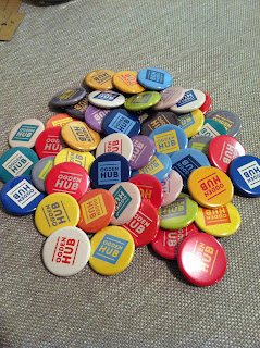
If some of the logos look familiar it is because I also used them when making the buttons in my last post. I might have overcompensated on the boring colors issue though. ;)
Next post I hope to have Natalie's wonderful photography again instead of pictures from my phone. Maybe I'll work on something not math related too! ;)


PS...as in PS to my comment on your last post...I love the black and white. I think it can be passé (Natalie will be impressed with my French) but your posters are very fresh and crisp and actually you comment about how it was a lot of info, but you organized it very well that I didn't even notice.
ReplyDeleteWell PS to your PS, sir!
DeleteThanks, I'm glad you liked them (and the buttons from the last post). Natalie will be very proud of your French! I can only do bad french accents like skunks in cartoons.